Does your current website accomplish these things? Whether it’s time to refresh or reinvent, be sure that your target audience is completely understood and that a thorough information architecture exercise is undergone. And then you can let the creative folks get their hands on it to design a compelling, emotionally resonating online presence.
I’m no mathematician. In fact, I was quite ecstatic when I learned that I didn’t even have to take another math class after my junior year in high school. I guess you could say that I lacked a bit of ambition, but girls and indie rock were far more interesting to me at the time. However, I will cower to no one when it comes to my logic above: clear and concise always trumps clever. This formula may put groups labeling themselves as “creative agencies” in a bit of a predicament, seeing how you are probably hiring them based on their creative prowess. Here’s the thing, and I’m sorry to get all mathematical on you again, but when you’re dealing with websites, especially information architecture (IA), creative – clever.
Look at the movement in web design over the last few years, white space, simplicity and elegance are being embraced more than ever. I can’t pinpoint it, and I know that usability pioneers like Jakob Nielsen have been advocating for clarity and ease of use for years, but that doesn’t mean that the web responded right away. I worked for a web design agency (really more of a factory) where the Quality Control Department actually penalized excessive white space. Flash was a darling for a good stretch, and even now, clients are still more concerned about what they aren’t saying rather than what they are saying. I think a lot of these cues were taken from the blogging world. The act of blogging necessitated something simple and it resonated with users. White space, clear content hierarchy and simplicity were a staple of blog design.
So this isn’t anything new, but rather a reminder to keep your focus on the most important things when undergoing a new or redesign of your website—make the end user’s life easier and alleviate friction. Wow, that end user sounds high maintenance! I don’t like walking on eggshells around anybody either, but the fact of the matter is your competition is waiting just a few spots further down in the Google results, telling your frustrated users to come in and take a load off.
I know my exposition on the matter is so compelling that you’re asking, “Brenton, please, tell us what we can do to adhere to your brilliant formula.”
Occam’s Razor
Sounds scary. You’re probably thinking, I don’t want to touch that guy’s razor, he sounds menacing. But this is actually a principle developed by William of Ockham stating that the hypothesis with the fewest assumptions should be selected or as I think of it, the simplest explanation is likely the correct one. What I’m saying here is, start simple. As clever as we may want to be and get away from certain conventions, we need to recognize that they have become conventions for a reason and they work. It’s not that users don’t want new and exciting online experiences, but in our vertical, they have a clear, often pragmatic purpose. So 99.9% of our sites are going to go live with “Accommodations” being that important first main navigation item. This meets buyer’s expectations and makes them comfortable as they are starting their experience. So start simple and keep it simple, you want to create the clearest path possible to a buying decision.
Think Top to Bottom
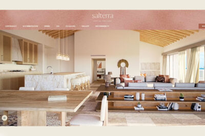
We are all consumers and just about every single one of us makes regular online purchases. Empathy is key here. I know, first world problems right? But we need to take a break out of our day and get in the shoes of the user and ask, what are the biggest questions I have going to this website? As much data as we have with our analytics, it will never compare to the first-hand interactions that you have with your guests. You know the questions, complaints and comments they have in regards to your website. Those big questions could be: “Where are you located?,” “What does your property look like?,” “What do I get for my rate?,” etc. Your homepage should at least begin to answer those questions. I know millennial marketing is all the rage and there are several contrived, clever, hipster-geared campaigns to cater to this generation, but you should keep in mind that they are skeptical and will sniff something out that lacks sincerity and are still pragmatic when it comes to making purchases of this nature. So start their journey on your site appropriately by beginning to answer those big questions so that they can be properly shepherded through your site and read about all of those amazing differentiators.
Increase Relevant Content Ratio
This is a benefit to your site’s search engine performance and the user experience. Hospitality industry websites are not the place for dense content. Visitors are not reading it and it typically isn’t your clever prose that is going to win them over. Yes, headlines and bullet points are important, but you need to have a meaningful strategy that is harmonious with that top to bottom IA strategy that you put into place. Make your content matter, 86 the fluff and write each page around a vetted value proposition. You’re not writing a travel brochure and typically your visitor is already sold on the destination, so don’t feel the need to try and resell them. You need to convince them that your property is the perfect one for them. Long gone are the days of needing a new page for every new thought and keyword saturation. Search engines are getting smarter and smarter by the day and want to see content that is relevant to your site. Are you a hotel? Talk about being a hotel in a lean and mean manner. Not only do search engines like it, so do your users.
Does your current website accomplish these things? Whether it’s time to refresh or reinvent, be sure that your target audience is completely understood and that a thorough information architecture exercise is undergone. And then you can let the creative folks get their hands on it to design a compelling, emotionally resonating online presence.
Brenton Crozier is Senior Manager of UX and Content Strategy, Vizergy.
Vicky is the co-founder of TravelDailyNews Media Network where she is the Editor-in Chief. She is also responsible for the daily operation and the financial policy. She holds a Bachelor's degree in Tourism Business Administration from the Technical University of Athens and a Master in Business Administration (MBA) from the University of Wales.
She has many years of both academic and industrial experience within the travel industry. She has written/edited numerous articles in various tourism magazines.


